Savasana: the colour of perfect calm

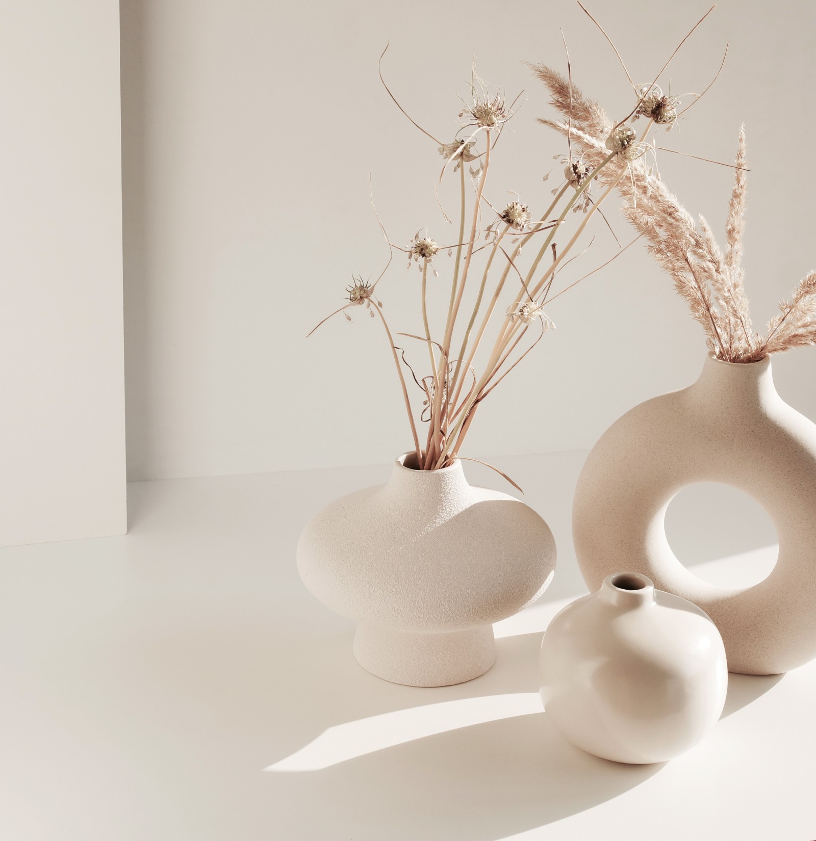
There are colours that speak to our hearts, that make us feel closer to ourselves. Savasana (#E727) is one of those colours. Inspired by the moment of greatest serenity in a yoga practice, this neutral and enveloping shade is the ideal invitation to transform your home into a true haven of peace.
Versatility that transforms every space
Imagine walls that breathe with tranquillity and bring harmony to every room. With Savasana, decoration becomes more than an aesthetic question: it becomes a sensory experience. It's a colour that welcomes, relaxes, and makes every space feel more intimate, more yours.
This neutral shade is incredibly versatile and complements any decor style. To create elegant and sophisticated contrasts, pair it with darker tones such as deep grays like Chinese Ink or petroleum blues like Blue Odissey. If the goal is to enhance lightness and tranquility, try combining it with warm whites or soft beige tones like Natural White. Savasana also harmonizes beautifully with natural wood elements, textile fibers, and metallic accents—from gold to matte black—for a modern and welcoming touch.
Imagine it in different rooms of the house:
- Living rooms, where every moment of socializing becomes more relaxing.
- Bedrooms, for a deep and comfortable night’s rest.
- Home offices, fostering a serene and balanced environment for productivity.
Experience perfect calm with Savasana
Let yourself be carried away by this neutral shade that blends in easily with any style, from minimalist environments to the most rustic and cosy. Breathe in, breathe out... and start painting. Because tranquillity, after all, can also be a choice of colour.
With VinylClean, our super washable matt paint, the Savasana colour comes to life with a flawless, long-lasting finish. Try this colour and see how small details can create a positive impact on your daily life. Transforming your home environment has never been so easy.
Let’s paint?
IMAGES
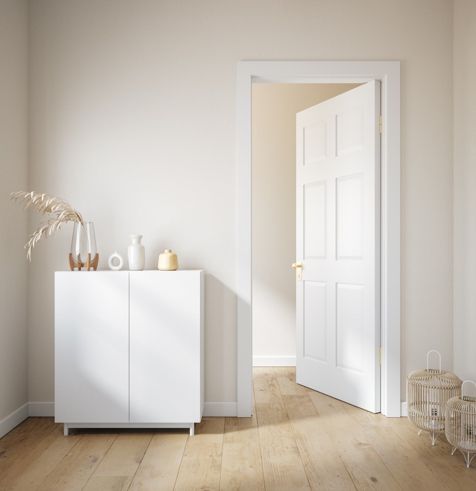
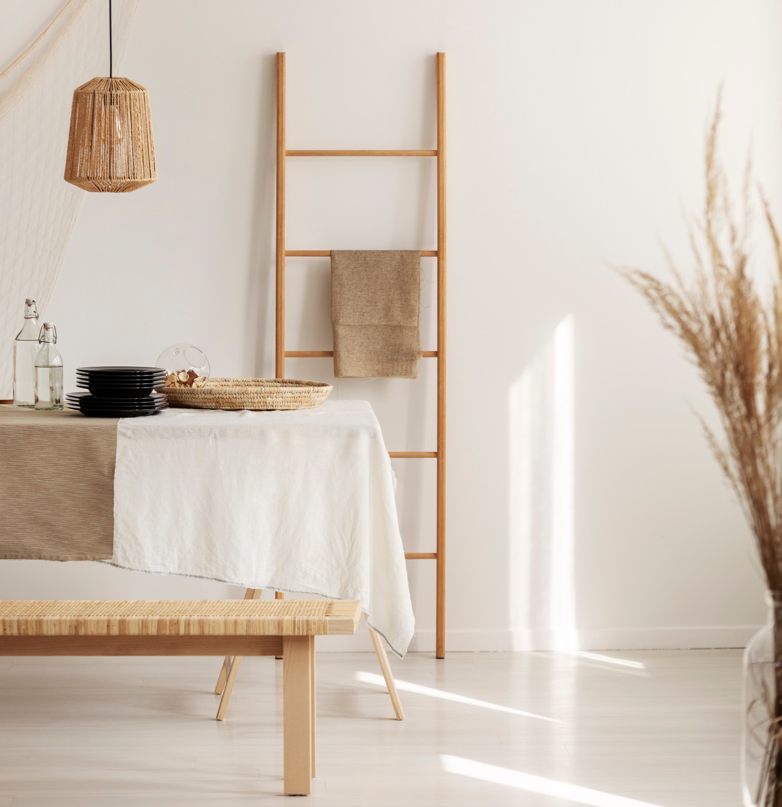
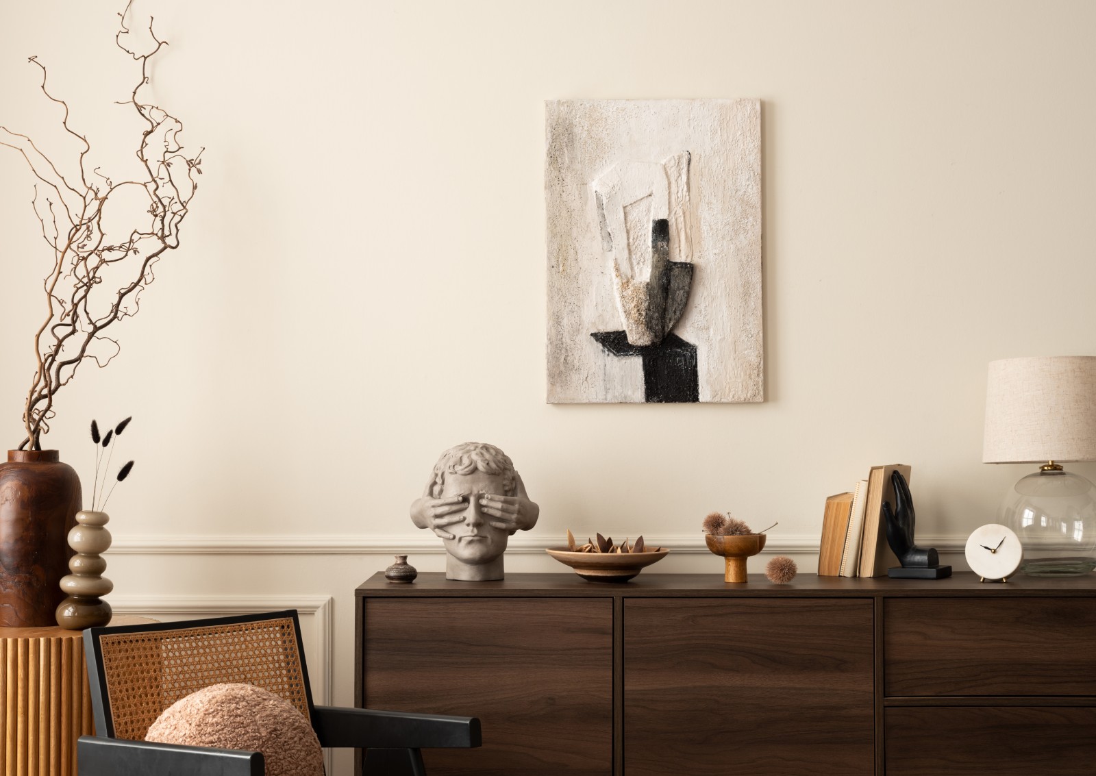
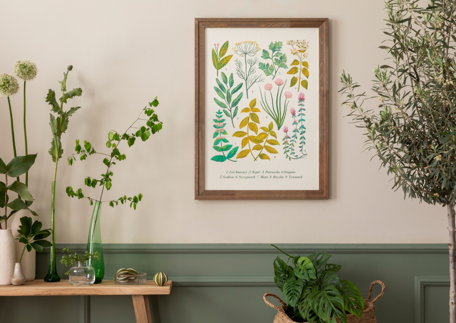
- 2. 3. 4. and 5. Colour reference on walls Savasana #E727 (Trends Catalogue).
There are always differences between the real colours and those displayed on the different screens. For a more precise choice, CIN recommends that you perform a colour test before any application.