
White tones for interiors: choosing the ideal shade for your décor style
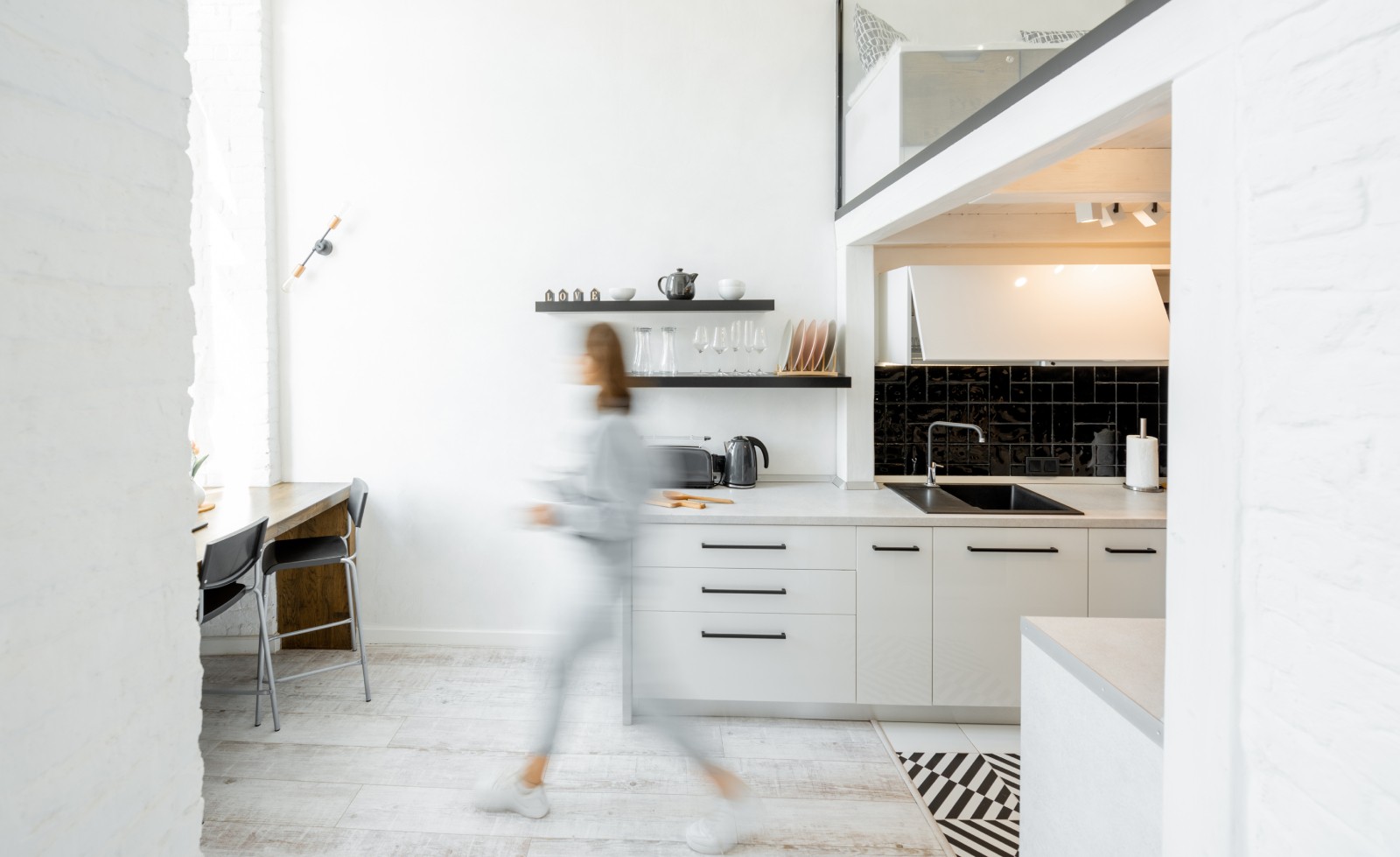
White has character. It visually enlarges spaces and fills any room with light. It can also be used to highlight special decorative elements or to add warmth to a space, depending on the shade you choose.
Although not everyone realises it, the white palette is incredibly broad. There are countless nuances that make each white unique and special. We’ve prepared a selection that shows that not all whites are the same – each has its own ability to transform a space and interact with light in its own way. Ready to discover them all?
THE MOST NEUTRAL WHITES: NO UNDERTONES OR COLOUR NUANCES
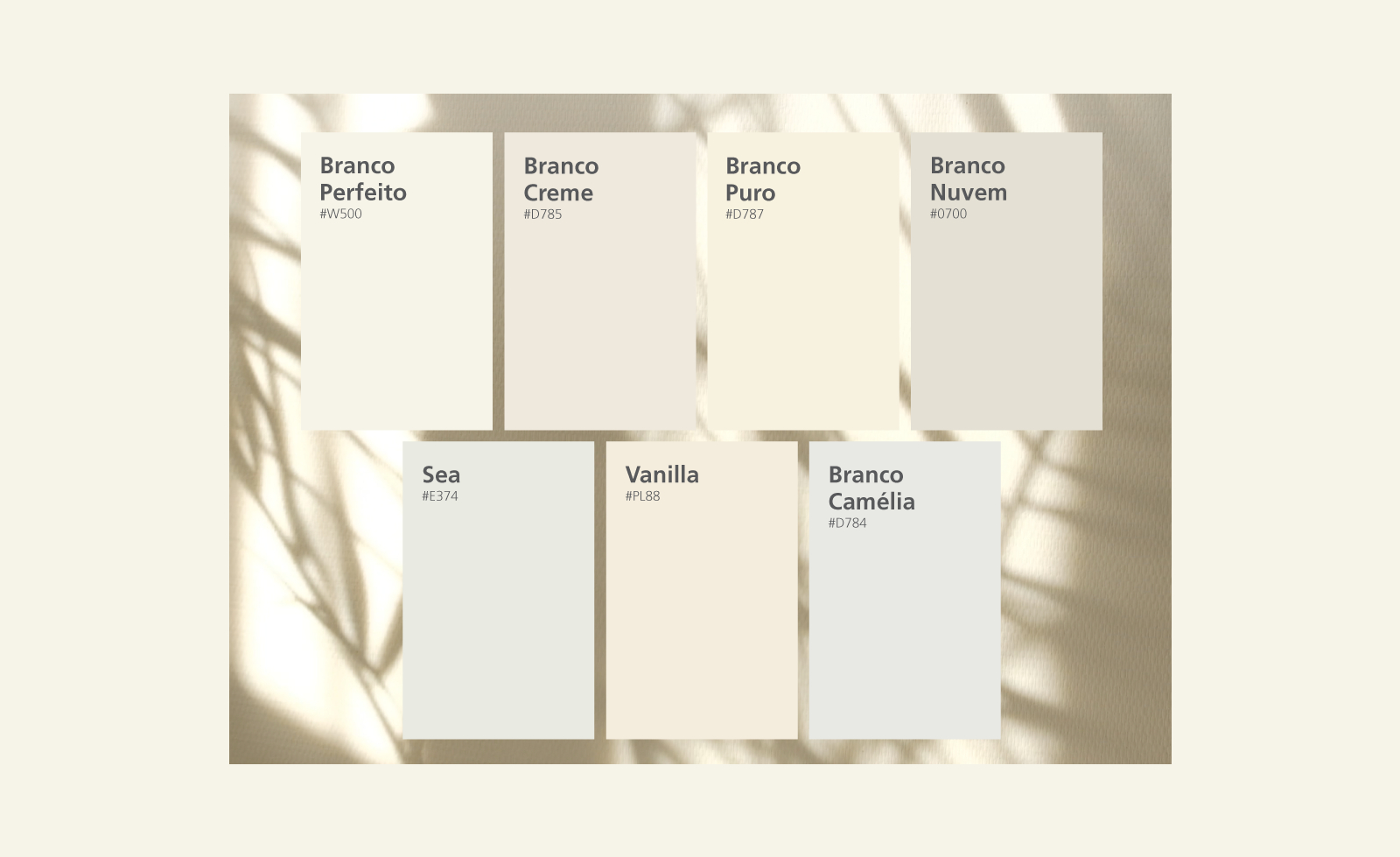
Puro #D787 will undoubtedly be one of the standout shades of the new season. It’s a fresh and luminous white, perfect for maximising brightness without altering the perceived colour of furniture or textiles. The ideal choice for minimalist or Nordic interiors.
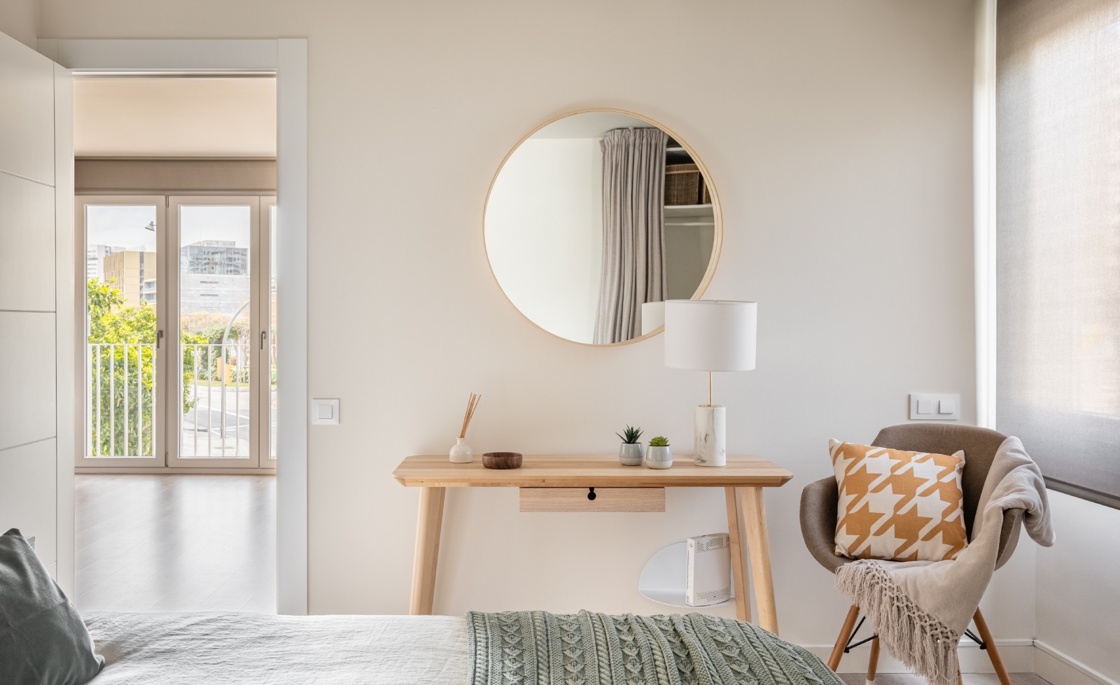
Savasana #E727 is a neutral, balanced shade, perfect for anyone seeking a timeless and versatile tone that works in any room and complements any style.
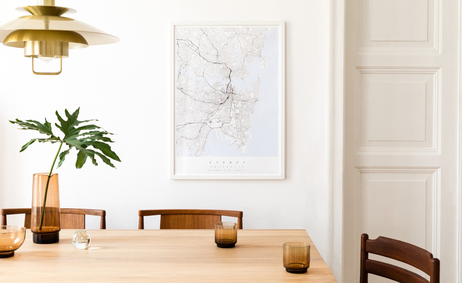
Either of these options provides the perfect base for playing with textures and contrasts without overwhelming the décor.
THE WARMTH OF WHITE: COSY AND ENVELOPING
For living rooms and bedrooms where comfort and serenity are key, the answer is Crema #D785. With its subtle hint of beige, it creates an inviting, enveloping atmosphere.
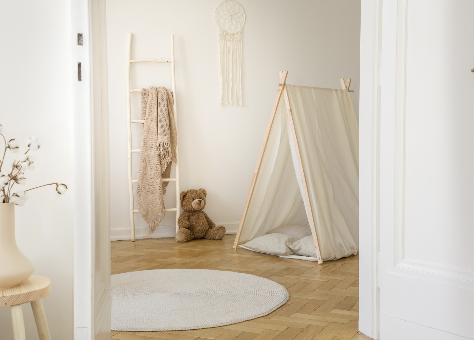
For something even warmer, Vanilla #PL88, with its gentle golden undertone, recalls sunlight filtering through curtains, filling the room with warmth while maintaining its brightness.

And how can you combine them? It couldn’t be simpler! These shades pair beautifully with natural materials such as wood, linen or ceramic, creating balanced and elegant spaces.
WHITES THAT MAKE A DIFFERENCE
There are also whites for those looking for something a little bolder, without giving up their timeless appeal, of course.
With a subtle grey undertone, Nebula / Cloudy White #0700 is the ideal shade for contemporary spaces. It gives rooms a sophisticated look while avoiding the coldness that some purer whites can create.

Sea #E374 is a white with a subtle bluish undertone that brings freshness and serenity, making it ideal for bathrooms or bedrooms where a sense of space and calm is desired.

Finally, Camelia #D784, with its almost imperceptible hint of pink, is an elegant and delicate option that works particularly well in rooms with warm lighting, giving them a cosy and refined touch.

Choosing the perfect white for your home – or each room – is no easy task. The right shade can make all the difference. Which one would you choose?
PHOTOGRAPHS
- Wall colour reference Puro #D787
- Wall colour reference Savasana #E727
- Wall colour reference Crema #D785
- Wall colour reference Vanilla #PL88
- Wall colour reference Nebula/Cloudy White #0700
- Wall colour reference Sea #E374
- Wall colour reference Camelia #D784
Please note that there can be differences between the real colours and those seen on photos or shown on different screens. For a more accurate choice, we recommend testing the colour before final application so you can see how it looks in the space under natural lighting conditions.